
Project Duration
Two months
Scroll, Search, Save
Disclaimer:
All works are the intellectual property of the company. The documentation was created to showcase the researcher's skills, trade, profession, and expertise.
Role
UX Researcher
Tools
Google Workspace, Figma
About the project
Booky is a local app and website that makes it easy for users to find restaurants, explore food options, claim vouchers, pay cashless, and read blogs.
This project highlights how understanding user personas improved key app features like restaurant discovery and voucher visibility.
By analyzing two main ways users find food and discounts—scrolling through the homepage and using the search bar—the research uncovered opportunities to enhance the experience and boost user engagement.
❓ Problem
The challenge was to improve the user experience of the Booky app, specifically focusing on:
What are the needs, behaviors, and pain points of different types of users when they use the app?
How can the app better highlight discounts and promotions to increase user engagement up to voucher redemption?
How effective is the search feature in providing relevant food and restaurant results or options to users?

🚀 Kickoff
Booky aimed to enhance user engagement by improving voucher discovery and visibility and refining the search function to provide more relevant results.
The research initiative began with a project manager's one-pager outlining the study's purpose and how it would address the current challenges within the Booky app.
📝 Planning
I was given a one-pager by the project manager that was a guiding document throughout the project because it consisted of why they wanted to research this topic, their expectations, business goals, and what action steps they should decide on.
I created a detailed research plan using the one-pager and forwarded it to the UXR Lead, Project Manager, UX Director, and Head of Product for approval.
Questionnaires and Scripts
The following research questions support the objectives.
The first set aimed to identify and understand user behaviors.
The second focused on how users discover vouchers and deals on the homepage.
The third consisted of tasks designed to evaluate how users accomplish each task using their mobile phones.
Objectives
To explore how users interact with the app and improve their experience by:
Understanding different types of users and their needs through personas.
Finding ways to make vouchers and discounts easier to notice and use on the homepage.
Testing how well the search and filter feature helps users find food and restaurants, and identify areas for improvement.
👫🏻 Preparation
Research preparation varies depending on the research methods chosen. I utilized user interviews and user testing to gather valuable insights in this study, as it will give deeper insights into the user experiences. I prepared the materials and tools that helped me to execute this research.
Recruitment of Participants
Recruiting participants is a crucial part of the preparation process for user interviews and user testing, as these require one-on-one interaction with participants. I posted on social media to recruit participants. Recruitment is the most challenging part of the process, in my opinion.
Explored and recruited a diverse group of participants representing Booky users across social media platforms such as Facebook, Instagram, TikTok, and Threads.
Sent out screening forms to ensure participants met the interview and testing criteria and were a good fit for this study.
Recruited 16 participants for user interviews: 11 for user persona interviews and 5 for voucher visibility feedback. We also had 8 participants for user testing to gather diverse insights."
Note: This recruitment process took place over different timeframes, as each research project (personas, voucher visibility, and search/filter) had its own set of participants and scheduling requirements.
🔎 Execution
User Interviews
Participants were recruited and interviewed to better understand user behavior, needs, wants, and pain points. The goal was to explore how users interact with the app to discover food and restaurants. This method provided rich qualitative insights into:
Behavior Patterns: How users typically navigate the app, including their decision-making processes.
Needs and Expectations: What users seek when searching for food, restaurants, or discounts.
Pain Points: Users experience Challenges and frustrations during their journey, such as difficulties finding relevant options or understanding available promotions.
User Testing
Conducted user testing to evaluate the search and filter feature, focusing on how participants use the app to look for food and restaurants.
Participants completed five tasks, designed to simulate real-life scenarios. This approach helped uncover insights into their navigation process, decision-making, and overall experience.
🔬 Analysis
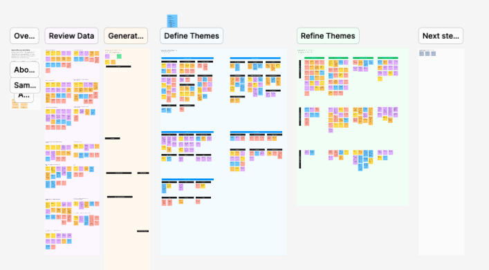
After conducting user interviews and user testing, I gathered and analyzed the data using thematic analysis with the help of FigJam for team collaboration. Thematic analysis is a qualitative research method focused on identifying, analyzing, and reporting recurring themes within the data. This method allowed a deeper understanding of user behaviors, needs, and pain points.
Process
Data Familiarization:
The UX team, composed of UX researchers and a UI/UX designer, collaboratively reviewed interview transcripts, task observations, and participant feedback.
We highlighted key quotes and verbatim in this part, ensuring no critical data was left out.
Coding the Data:
Since we already have groups of key quotes and verbatim, we started coding the groups depending on users' patterns, actions, or sentiments.
Theme Development:
We created columns, added related codes, and applied a theme title that best suits every code. Since the " Scroll, Save, and Search" portfolio comprises three different research projects, these are some of the themes we used to analyze the data.
Challenges with Homepage Navigation
Frustrations with Search Filters
Influence of Discounts on Decision-Making
After presenting the themes that we gathered using the data from user interviews and user testing. We provided actionable steps to improve it and bridge the gaps.
Collaboration and Synthesis:
The UX team conducted the analysis collaboratively to incorporate diverse perspectives and ensure findings were well-rounded.
We prioritized insights from analysis based on frequency and impact on user experience for actionable steps.
👩🏻💻 Debrief
I presented the research findings to the delivery team, which included UI/UX Designers and key stakeholders. The deck and other deliverables were shared in a dedicated thread for easy access after the presentation. The question and answer portion followed the presentation, where designers noted the recommendations from the research for design improvement and aligned with their respective squads.
📊 Outcome
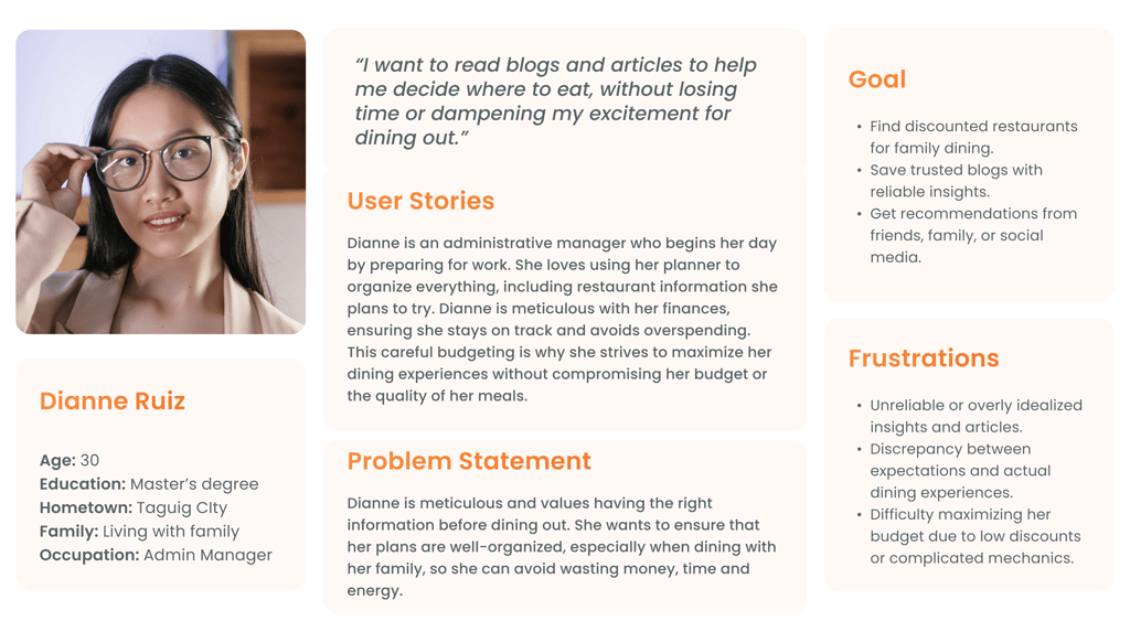
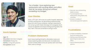
User Impact: User Personas
With the team's help during thematic analysis, I identified and updated two user personas that accurately represent the app's most common user groups. These personas are essential for understanding user needs, behaviors, and motivations, serving as valuable guides for designing user-centered solutions and improving the overall app experience.
With the integration of personas, the research provided a deeper understanding of who the users are and their goals when using the app. User personas help align the app's design with user needs.
Enhance the user experience to help individuals quickly and efficiently decide where to eat, allowing them to navigate the app effortlessly without spending too much time.


Product Impact: Homepage
Users are usually attracted when they see high-value offers, which are more affordable and helpful for decision-making. This type of external trigger makes the users more curious, leading them to try it.
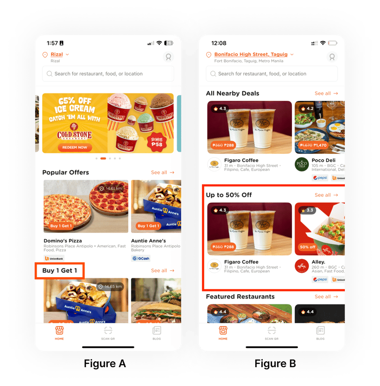
Figure A: While users like Buy 1 Get 1 (BOGO) offers, those living solo or buying for themselves often prefer percentage-based vouchers. However, the lack of a dedicated filter and confusion about where to find these deals hinder engagement and voucher redemption.
Figure B: A new homepage section for percentage-based vouchers was introduced based on research. This section enhances user experience by simplifying deal discovery and reducing scrolling.

Product Impact: Search and Filter
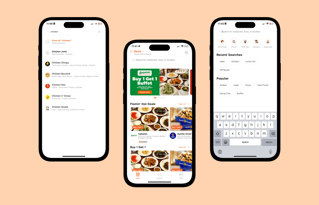
Users want fast and relevant search results to make quick decisions. They often type directly into the search bar for specific restaurants or dishes.
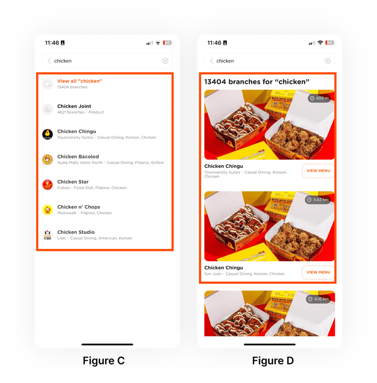
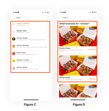
Figure C: Suggestions while typing are helpful, but many users skip them and hit 'Search' immediately.
Figure D: Users find it hard to narrow down results and find where they want to eat because there is no way, such as filters at the top. Showing multiple branches of the same restaurant also adds unnecessary clutter, especially when users want nearby options.
To improve the experience, adding filter chips or navigation options, including ratings, location, cuisine, and price range, on the results page is suggested. These filters help users quickly sort by cuisine type, location, price, discounts, or ratings.
Update: Designers are already working on ways to make this feature user-friendly and straightforward.
💡 Takeaways
My Learnings
Conducting user research is a critical step in improving a product. I carefully approached each stage of the process to ensure alignment with project goals and management expectations. The focus was not on perfection or adding many features, but on delivering insights that address user concerns and support business objectives. Working on research projects for Booky provided valuable lessons, and leading each assigned study was a rewarding and cherished experience.
Challenges
Participant Recruitment
One of the main challenges faced by the research team was recruiting participants. Securing participants for interviews was difficult, which affected the project timeline. Some participants did not show up for their scheduled meetings, causing delays.
Collaborative Thematic Analysis
Initially, collaborative thematic analysis was a challenging process, especially since it was a new approach that involved both UX researchers and UI/UX designers. However, after a series of improvements and feedback loops, the process was finalized and completed smoothly.
Thank you for making it this far! I hope you enjoyed reading it and found it insightful!